


SherMatch+ by Sherwin-Williams
3.6568.00 Reviews
App Specs
- Version
- Varies with Device
- Updated On
- License
- Free
- Downloads
- 500,000+
- Developer
- Variable, Inc
- Categories
- House & Home
- Platform
- Android, iOS
Screenshots
 Analysis by AppCompare
Choosing paint usually starts with a small problem that grows quickly: I have a room in mind, but not a reliable way to picture a color on a whole wall. A paper chip is easy to carry around, yet its appearance shifts with the light and the things beside it. SherMatch+ by Sherwin-Williams is aimed at that decision-making stage, bringing color matching and room previews into a home-focused app. I see it as a planning aid, not a substitute for checking a real paint sample before committing.
From a Color Idea to a Paint Decision
First things first, SherMatch+ is available on both Android and iOS, so you’re covered regardless of your smartphone allegiance. Setting it up is a breeze. Once installed, the app welcomes you with a clean and intuitive interface, steering clear of any unnecessary clutter. Trust me, you won’t need a degree in computer science to navigate this app.
The initial setup involves a quick account creation or a simple sign-in if you’re already a Sherwin-Williams aficionado. After that, you’re good to go. The app's design is sleek, with a modern touch that makes it visually pleasing. It's like a breath of fresh air compared to some clunky apps I've stumbled across.
Start with the Right Reference
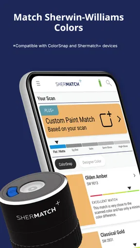
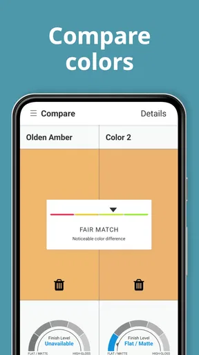
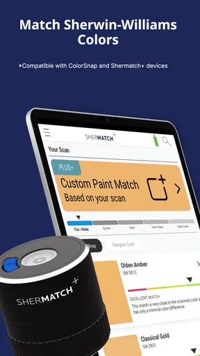
Now, onto the fun part. The standout feature of this app is its color matching capability. Imagine you’re at a café and fall in love with the color of the wall—snap a photo, and voila!, SherMatch+ works its magic. The app analyzes the image and matches it to the closest Sherwin-Williams paint color. It’s like having a personal color consultant in your pocket.
For a useful result, I’d treat the photo as a starting clue rather than a paint formula. A phone camera can capture a wall differently under warm bulbs, daylight, shadows, or reflections, so I’d take the picture in even light and avoid including shiny objects or deep shadows in the area I want matched. If the color matters, I’d capture a second image in another lighting condition and compare what the app suggests. That extra check is especially worthwhile when matching a small accent or fabric detail, where surrounding colors can influence what looks right.
This is also where the app’s limits matter. A close match on a screen cannot promise that the painted surface will look identical: wall texture, finish, room orientation, and changing light all affect the result. I would use matching to narrow the field, then inspect physical paint samples at home. That workflow is slower than choosing from a phone alone, but it reduces the risk of buying paint based on a misleading photo.
Build a Scheme, Then Test It in the Room
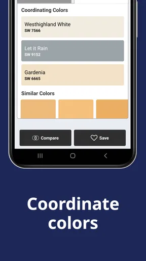
But wait, there's more! The app doesn’t just stop at matching colors. It offers suggestions for coordinating colors, which is super helpful if you’re trying to create a harmonious color scheme. Say goodbye to mismatched disaster rooms!
Worth Reading Before You Choose

EA SPORTS FC Mobile 26 Is a Bigger Football Game, but It Takes Time

Flipboard Shows What News Apps Must Do Beyond the Feed

Switching to Android Auto Means Rethinking Your Driving Routine

Google Calendar Makes a Crowded Week Easier to Manage

Ludo King Makes the Most of the Minutes Between Plans

Baby Panda World Brings Quick Play to Modern Phones, but Its Game Library Feels Busy
I find those suggestions most useful when I already have one fixed element to work around, such as a sofa, tile, or wood floor. I can begin with a color that relates to that anchor, then use coordinating options to explore a calmer wall color or a stronger accent. It is less useful if I expect an automatic design verdict: a suggested combination still needs to make sense with the furniture, natural light, and the mood I want in that specific room.
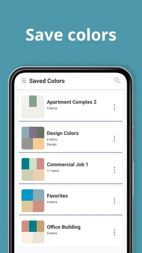
One practical way to avoid cycling through endless options is to save a small shortlist rather than treating every appealing color as a contender. I’d compare only a few candidates at a time, checking them against the room’s permanent finishes and the purpose of the space. A restful bedroom and a busy entryway do not need the same level of contrast, even if the colors look attractive on a palette.
Preview the Room, but Keep the Lighting in Mind
One of my favorite features has to be the virtual reality (VR) function. You can use your phone’s camera to visualize how different paint colors will look on your walls. It's a game-changer, folks. You can literally see your room transform before your eyes without lifting a paintbrush. This feature alone might just save you from a lifetime of paint regrets.
The VR tool is surprisingly accurate, giving you a realistic preview of how the colors will interact with your room’s lighting and decor. It's like trying on clothes before buying them, but for your walls. Pretty neat, right?
For a realistic trial, I’d preview the same wall at different times of day rather than deciding from one quick look. A color that feels balanced in bright daylight can seem much heavier after sunset, while a pale shade may appear cooler beside warm furniture. I’d also move around the room and check more than one wall; a single camera angle can make a color seem more uniform than it will feel when the room is actually painted.
The preview is best for answering broad questions: does this direction feel too dark, does a warmer tone fit the room better, or does an accent wall compete with the rest of the space? I wouldn’t use it to judge tiny differences between near-identical shades. A screen image is helpful for narrowing choices, but a physical sample viewed in the room is the better final check.
Save Choices and Hand Them Off
Aside from its impressive color matching and VR capabilities, SherMatch+ offers a wealth of information on each paint color. You can access details like the color’s LRV (Light Reflectance Value), which is a fancy way of saying how much light the color reflects. Handy, especially if you’re trying to brighten up a space.
LRV is useful as a comparison point, not a shortcut to predicting the whole room. If I am choosing between several colors, it can help me understand which one reflects more light, but it cannot tell me whether the shade will feel welcoming beside a dark floor or washed out near a bright window. I’d use it to eliminate options that are clearly too light or too deep for my goal, then rely on the room preview and a sample for the finer judgment.
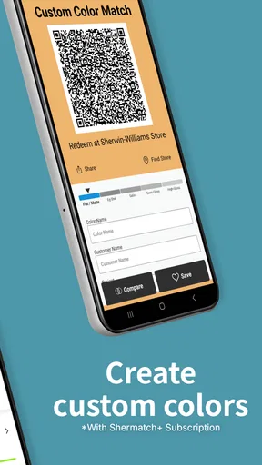
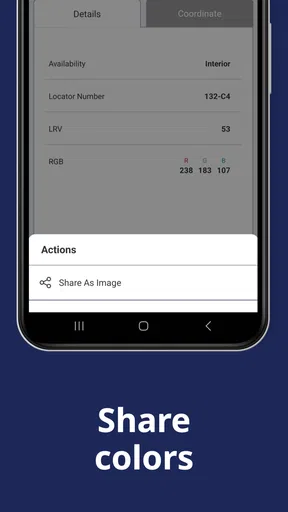
The app also allows you to save your favorite colors and create custom palettes. This is particularly useful if you’re working on a bigger project or just love to keep your options open. You can even share your palettes with friends or contractors directly from the app, making collaboration a breeze.
That sharing step can make a real handoff easier: I can collect the options in one place, then show the shortlist to a partner or contractor instead of trying to describe a color from memory. Before sending it, I’d remove the exploratory shades and keep only the finalists, with a note about where each might go. It helps everyone discuss the same choices, though the other person should still verify the actual paint color and finish before work begins.
For a familiar scenario, imagine I am refreshing a living room while keeping the existing rug and sofa. I could photograph a color detail from the rug, use the match as a starting point, browse coordinating colors, and preview a few options on the walls. Then I would save the best candidates and share that short list with whoever is helping me paint. The app supports the thinking and communication stages; I would still bring home samples before settling on one.
Where the Workflow Can Fall Short
The main friction is the gap between a digital suggestion and paint on a real wall. Camera matching and room visualization depend on how the phone sees the space, while the actual result also depends on lighting, surface, and finish. That is not a reason to avoid the tools; it is a reason to use them as filters rather than guarantees. Someone who wants an exact color match from a photo with no follow-up testing may find the process less conclusive than expected.
There is also a brand boundary to keep in mind. The app is centered on Sherwin-Williams colors, so it makes the most sense if that is where you plan to shop. If you are comparing paint from several brands, a general color reference or visits to multiple paint counters may suit you better. Likewise, someone who already has a precise color picked and only needs to calculate materials may get more value from a project-specific estimator than from a color-planning tool.
In the broader home and paint-app category, the practical alternative is often a mix of physical swatches, store advice, and a phone camera. SherMatch+ brings matching, palette exploration, room visualization, and saved selections together in one place, which is convenient when the decision is still open. The trade-off is that its digital tools can create a sense of certainty that a sample on the actual wall is better suited to provide. I’d use the app to reduce the options, not to skip the sample stage.
For a homeowner tackling one room, a renter planning a refresh, or anyone who struggles to imagine a color across a larger surface, the workflow is approachable and useful. It is less compelling for people who dislike account-based app setup, want a brand-neutral comparison, or expect a phone preview to settle every detail. SherMatch+ is free to download, though it includes in-app purchases ranging from about five dollars to about forty-eight dollars per item, so I’d check what is included before making a purchase.
Who It Suits and My Take
All in all, SherMatch+ is a useful option for anyone looking to tackle a painting project. Whether you're a DIY enthusiast or just someone looking to refresh a room, this app offers a ton of value. It takes the guesswork out of color selection and ensures that your walls will look exactly how you envisioned them.
I would soften that last promise: it can make color selection less uncertain, but no preview can ensure an exact finished result. SherMatch+ is a House & Home app from Variable, Inc, with an average rating of three and a half stars from around fifteen hundred ratings. It has been installed over five hundred thousand times, is rated for everyone, and was released on February 2, 2017. The current product name reflects its move on from ColorSnap Match, while the store identifies its focus as pro color and sheen matching with SherMatch+.
The app is a stronger fit for someone who wants to explore Sherwin-Williams colors before visiting a store or beginning a project than for someone who already knows the exact shade and simply needs to buy it. Its best contribution is helping me go from an inspiration photo to a manageable shortlist, then giving me a way to discuss those choices with another person. I would keep real samples in the process, especially for large rooms or colors that change noticeably in different light.
So next time you’re staring at a wall of paint chips, overwhelmed and unsure, remember that there’s an app for that. Give SherMatch+ a try, and let it guide you to your perfect shade. Your future self will thank you.
Pros
- Easy color matching with photos.
- Large database of paint colors.
- User-friendly interface.
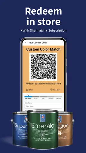
- Integration with Sherwin-Williams stores.
- Quick access to paint details.
Cons
- Limited offline functionality.
- Occasional app crashes reported.
- Requires account for full features.
- Limited to Sherwin-Williams products.
- No direct purchase within app.
FAQs for SherMatch+ by Sherwin-Williams
What is SherMatch+ by Sherwin-Williams?
SherMatch+ is a mobile app developed by Sherwin-Williams designed to help users find the perfect paint colors for their projects. It offers features such as color matching, virtual room painting, and personalized recommendations, making it an essential tool for both DIY enthusiasts and professional painters.
How does the color matching feature work in SherMatch+?
The color matching feature in SherMatch+ uses your device's camera to capture colors from any object or surface. The app then matches the captured color to the closest Sherwin-Williams paint options, providing a seamless way to find the perfect shade for your needs. It’s a handy feature for ensuring color accuracy.
Is SherMatch+ available for both Android and iOS devices?
Yes, SherMatch+ is available for download on both Android and iOS platforms. Users can find the app in the Google Play Store for Android devices and the App Store for iOS devices. This ensures a wide accessibility for a variety of users, no matter their device preference.
Does SherMatch+ offer any virtual painting features?
SherMatch+ includes a virtual painting feature that allows users to visualize how different paint colors will look in their spaces. By using augmented reality technology, users can see a realistic preview of their rooms painted in selected colors, helping them make more informed decisions before purchasing paint.
Are there any costs associated with using SherMatch+?
SherMatch+ is free to download and use. However, while the app itself does not have in-app purchases, users will need to purchase Sherwin-Williams paint separately if they decide to proceed with a color choice. This makes the app a cost-effective tool for planning your painting projects.


